Thursday, 2 October 2014

Why choose an iPhone over others?

- Aditya Kumar Singh
  • Being an iPhone user, the very first thing that gets noticed is the build quality of an iPhone (or any apple product for that matter) stands above any smartphone in the market; the closest coming would be the HTCs.
  • The second would be the smart, sleek and simple user interface, unlike the sophisticated android UI .Steve Jobs took great pride in the fact that apple products are shipped without a user manual! So simple, yet so unique in the tiniest details!
  • The display of the #iPhone is a fair 326 PPI (latest iPhone has 400 approx). PPI (Pixels Per Inch) is slowly becoming the most non essential spec that is featured in the recent smartphones as it’s nearly impossible for an average human eye to distinguish pixels more than 300-400 from the distance phones are held.  
 
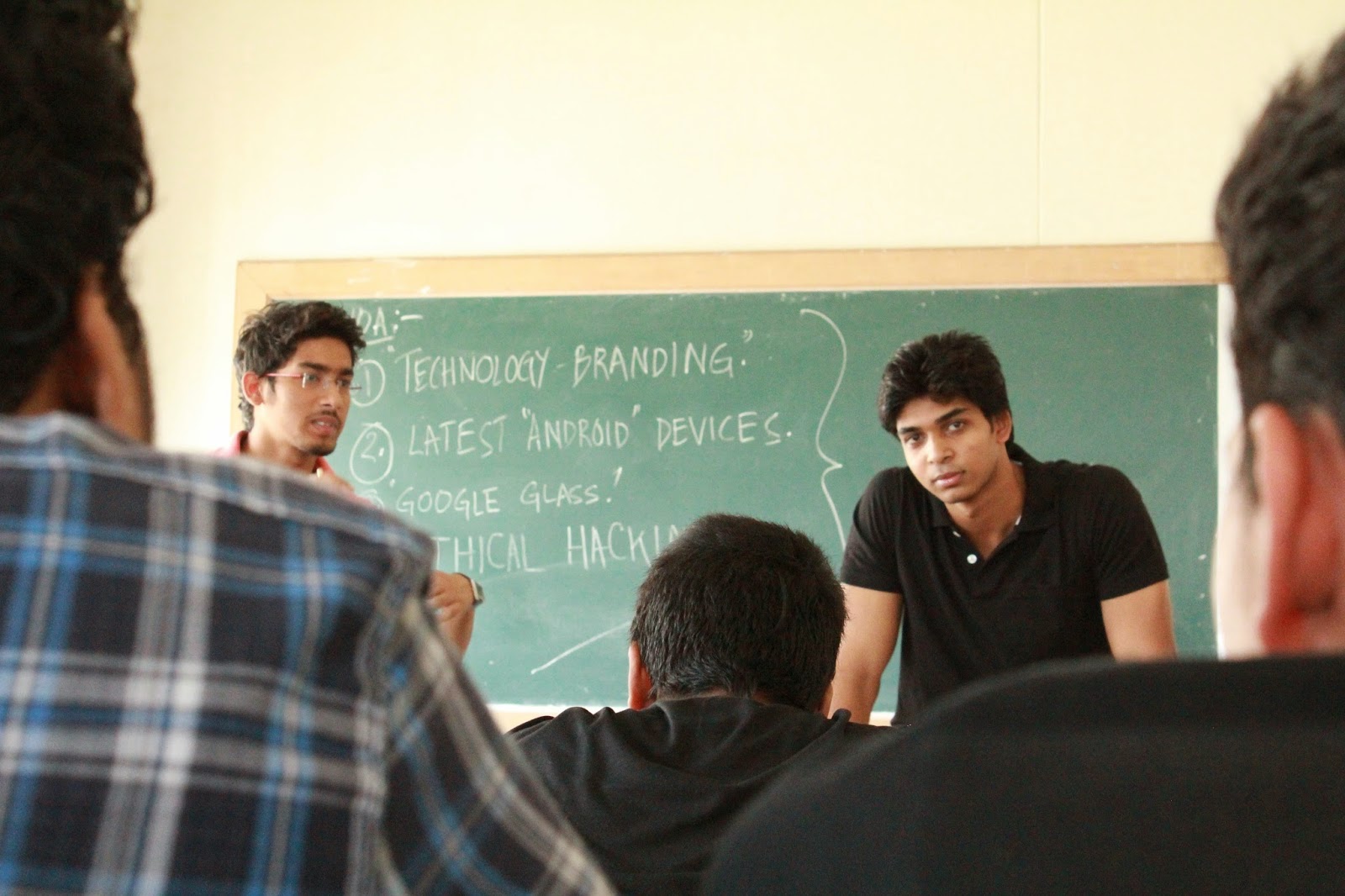
Aditya and Subhranil explaining how iPhone has an edge over others in GD1.0

  • Apple iPhone 6 features 2nd generation 64 bit desktop class Dual Core A8 processor which clocks up to 1.4GHz and still comfortably beats all quad core flagship Smartphones at performance, that’s how power efficient apple interface is!


  • Camera of the iPhone is very famous in the world of photography and the latest one features a mere 8 MP camera.Although MP(Megapixels) of a phone is'nt the only thing that determines the camera quality.Many other technical software features,for example their patented optical image stabilization, focus pixels, cinematic video stabilization are involved, that are generally not considered by the people.


  • As seen, an Apple product is certainly not determined by the specs they feature as there is nothing catchy about it. To experience its performance and feel, it requires a hands-on experience, which of course would cause a deep hole in your pocket, but in general would not be regretted for sure!
Google+

Tuesday, 30 September 2014

A buzz of Windows 9 finally comes to an end ! ' Windows 10 ' it is

Microsoft just unveiled its next operating system. 

Instead of announcing the next version of its iconic operating system in front of a massive crowd of thousands, Microsoft chose an intimate venue with 50 or so reporters to launch the new Windows, which it's calling Windows 10. The company looks at the new number (yes, it skipped a number) as an indication of the direction it's taking with the OS; Microsoft says it'll be "the most comprehensive platform ever," featuring a full range of products that'll be placed under the Windows 10 umbrella as part of "one tailored experience." Microsoft's Joe Belfiore showed off an early beta version of the new Windows on stage, which looks very much like the leaked screenshots we saw not too long ago; Belfiore says that they wanted to bring the familiarity of Windows 7 and combine it with the functionality of Windows 8.

The new Windows will look very familiar if you're used to either of the the last two versions, though Win8 users will notice that the Modern UI is nowhere to be seen at first. Instead, the series of Live Tiles can be found in the Start Menu off to the right side, with the usual Win7-style set of pinned and frequent apps on the left side, along with web and app search underneath. It also comes with a refreshed taskbar that comes with a new "task view," which essentially lays out all of your running apps. You can also tile up to four apps on the same screen. Additionally, Windows 10 also gets a nice improvement to the command prompt: Now you can use keyboard shortcuts, as well as copy and paste.
The Charms Bar is still there, though it may not look exactly the same when the final build comes out -- Microsoft says that the UI is still not final and it expects to change it between now and then -- and there are plenty of touch elements and gestures carried over from Windows 8.

With Windows 10, Microsoft also plans to adjust the user interface depending on the mode you're using it in; for instance, it'll look different if you're using it for touch versus if a mouse and keyboard are detected. The Modern UI shows up as a "large Start Menu" in addition to a back button on the task-bar when you're in touch mode, whereas you'll get the traditional desktop look and feel if you're using a keyboard and mouse.
Belfiore insists that the new Windows will give full functionality for everyone from beginners and novices to advanced users.

Belkin’s pricey Thunderbolt 2 dock embodies PC users’ apathy toward Thunderbolt


Belkin just announced a new Thunderbolt 2 docking station that delivers a massive 20 Gbps of bandwidth, but whose $300 price tag goes to show why PC buyers have expressed so little enthusiasm for the speedy new bus.
The Thunderbolt 2 Express Dock HD is designed to work with laptop or desktop systems that have Thunderbolt ports, either PCs or Macs. Intel developed Thunderbolt, but only Apple has embraced the technology with open arms. PC manufacturers, on the other hand, have been reluctant to support it because of the cost it adds to a system. Even “Thunderbolt ready” desktop motherboards merely have Thunderbolt headers on them; buyers must purchase a Thunderbolt add-in card separately (at a cost of $85 to $100).
Belkin’s powered dock has two Thunderbolt 2 ports, three always-on USB 3.0 ports (that can charge an attached device whether or not a computer is attached to the dock), one HDMI 1.4b port, gigabit Ethernet, a headset jack in front, and an audio output in back.
The dock can drive up to two displays directly (one must be a Thunderbolt or Display Port model), and it supports 4K video resolution on one display. 4K refresh rate via HDMI, however, will be limited to 30Hz. That’s a limitation of HDMI 1.4b (resolved by HDMI 2.0), and it’s no big deal if you’re watching movies. It will be problematic with an HDMI display if you’re doing anything painstaking, however, such as editing photographs or playing games.
If you need oodles of bandwidth—say, for editing 4K video—Thunderbolt 2 is a fantastic technology. It’s four times faster than USB 3.0, and 25 times faster than Fire Wire 800 (another bus technology that never gained much traction in the PC MARKET). In addition to being supremely fast, Thunderbolt 2 allows you to daisy-chain devices (up to six from a host computer, or up to 5 from a dock like Belkin’s) from a single port.

If the technology wasn’t  so freaking expensive, I’m sure it would be a lot more popular with PC users. It's the usual conundrum: Thunderbolt won't get cheaper until there's mass adoption, but mass adoption won't occur until Thunderbolt gets cheaper.
Be that as it may, Belkin says its $300 Thunderbolt 2 Express Dock HD (Belkin model number F4U085bt) is available for purchase now (including a 1-meter Thunderbolt cable) at www.belkin.com.

Google unveils Drive for Education with free, unlimited storage and ‘Classroom’ integration

-Arkodyuti Saha
Google Apps for Education just got a little bit sweeter: In the coming weeks, new and existing customers will have access to Drive for Education, an academic version of its online storage solution.
Drive for Education follows Drive for Work and boasts unlimited storage, support for individual files up to 5TB in size and automatic encryption. “Every file uploaded to Google Drive is encrypted, not only from your device to Google and in transit between Google data centers, but also at rest on Google servers,” 
The service will be bolstered with Google Apps Vault, a compliance-focused tool for administrators, before the end of the year. Google is also promising a swathe of reporting and auditing tools, as well as an Audit API for tracking files.
Google Apps for Education is free for nonprofit educational institutions and comes with Classroom, a tool-set that teachers can use to deliver classroom materials, track assignments and give students feedback. With the new Drive for Education, projects that users create and manage through Classroom will be organized automatically into Google Drive folders. Seamless stuff.

REALM releases its developer-friendly mobile database on Android

 -Arkodyuti Saha & Aaditya Raj

'Realm' has released the Android version of its mobile-database solution for developers, which soft-launched on iOS over the summers. The open-source library bucks the trend of cloud-based databases by storing information on your device.
Since launching on iOS, Realm has attracted 20,000 developers to its product in just a short few weeks. Apps like Cloth and Breeze have already shipped with Realm inside. The team began development in 2011 and graduated from the Summer ’11 Y Combinator class.
Realm claims that its solution reduces the development time of an app by as much as half. Once deployed, the code has a smaller footprint and runs faster queries than its competitors.

While Realm’s core product is open-source, the company also sells enterprise software licenses. For instance, Zynga hired Realm back in 2012 to build a database that allowed it to shut down a number of cloud clusters required by its previous solution.

Monday, 29 September 2014

FREE WIFI = MAP OF NETWORK THREATS ?


-Arkodyuti Saha

Skycure hacked an iPhone in just a few minutes and the user was immediately convinced that network attacks were a problem. Though this was an extreme example,it's been a long been warning to all the readers about the dangers of public Wi-Fi networks and the prevalence of attacks that can silently sip your personal data without your knowledge Skycure's CEO and co-founder Adi Sharabani revealed a new tool that makes those invisible attacks a little easier to see. Just search a location on maps.skycure.com and you can see how many naughty networks are in your area. You might be surprised, or just plain horrified.

How it Works: 

The site is built on Google Maps, so search for any location as you would normally. Skycure then searches through its database of known malicious networks, and places pins on the map for any nasty network its users have encountered in that area within the last six months. Results are shown within a red circle.

I find that being specific yields the best results. An address in Vellore yields far more useful data than a search for "Chennai,India." For broad searches like these, Skycure's search radius is just too small and centered apparently at random.

Not surprisingly, Skycure Maps works best in urban areas where there are lots of people and lots of Wi-Fi networks. Searching my hometown in 'Kolkata' turned up two results for the entire lower peninsula, both of which were (not surprisingly) at the railway station. Obviously, the big limitation of Skycure maps is the number of users the service can draw data from and where those users have been.

The data for the map is drawn anonymously from Skycure users. When a user connects to a network, Skycure tests it to see if everything is on the up and up. If it's not, a warning appears on the user's phone and the unsafe network is logged on Skycure's servers. Skycure uses this knowledge of malicious networks, the network's location, and the
network's hardware configuration, to better protect its users.

Skycure says that although the map's information comes from users, it's entirely anonymized. "We do not have any visibility to any data on your device, your emails, passwords, or the ability to do so," said Sharabani. "But we prevent the attackers from having the ability to do so."

What You'll See:

You can click each pin to see the name of the suspicious network, and a brief description of why it's dangerous. Sometimes, you'll see a Google Street View image, too. Sharabani says that the location of the Wi-Fi network is accurate to within a few meters, but not always. Search for the PC Mag offices and you'll see the malicious network used to test the Skycure app for my review.

You'll probably see the highest concentration of questionable Wi-Fi networks at airports. That's partly because these networks are sometimes configured without privacy in mind. More interesting is when a Boingo hotspot appears in the middle of a residential neighborhood. These networks are almost always fake. Attackers use the name of popular
wireless services to trick devices into automatically connecting to a malicious network.
At a glance, most of the pins on the map aren't malicious networks per-se but many have entries that say the network could potentially leak your
personal information.

From my experience using Skycure on my personal device, that seems accurate. To be clear: these networks should be avoided the same as overtly malicious ones.

A snap from CHiPSET ,G.D:1.0.


What Does it Mean?

Skycure Maps exists partly to promote its mobile app, but it's also to prove a point. "Attacks are happening everywhere," said Sharabani."Don't believe me. Search for it." He recommends that everyone, especially professionals traveling to conferences, scout around to get a feel for their network environment. Looking at the map, it's hard to disagree that the threats are real. In my hostel, Skycure found three networks that could
leak my personal information, and at least one that is outright dangerous. The next time someone asks me if they should be concerned about connecting to the Starbucks Wi-Fi, I'll just point them to this map.

Saturday, 20 September 2014

GOOGLE GLASS: Designed For those who Move !

Google Glass is a type of wearable technology with an optical head-mounted display (OHMD). It was developed by Google with the mission of producing a mass-market ubiquitous computer. Google Glass displays information in a smartphone-like hands-free format.Wearers communicate with the Internet via natural language voice commands.Google started selling Google Glass to qualified "Glass Explorers" in the US on April 15, 2013 for a limited period for $1,500, before it became available to the public on May 15, 2014 for the same price.
Google Glass was developed by Google X, the facility within Google devoted to technological advancements such as driver-less cars.
Google Glass is smaller and slimmer than previous head-mounted display designs.

Features

Loïc Le Meur controls Google Glass using the touch pad built into the side of the device
  • Touchpad: A touchpad is located on the side of Google Glass, allowing users to control the device by swiping through a timeline-like interface displayed on the screen. Sliding backward shows current events, such as weather, and sliding forward shows past events, such as phone calls, photos, circle updates, etc. 
  • Camera: Google Glass has the ability to take photos and record 720p HD video.
  • Display: The Explorer version of Google Glass uses a Liquid Crystal on Silicon (LCoS), field-sequential color, LED illuminated display. The display's LED illumination is first P-polarized and then shines through the in-coupling polarizing beam splitter(PBS) to the LCoS panel. The panel reflects the light and alters it to S-polarization at active pixel sites. The in-coupling PBS then reflects the S-polarized areas of light at 45° through the out-coupling beam splitter to a collimating reflector at the other end. Finally, the out-coupling beam splitter (which is a partially reflecting mirror, not a polarizing beam splitter) reflects the collimated light another 45° and into the wearer's eye.
#Google Glass applications are free applications built by third-party developers. Glass also uses many existing Google applications, such as Google NowGoogle MapsGoogle+, and Gmail.
Many developers and companies have built applications for Glass, including news apps, facial recognition, exercise, photo manipulation, translation, and sharing to social networks, such as Facebook and Twitter.

    (A snap from CHiPSET G.D:1.0)


Google offers a companion Android and iOS app called My-Glass, which allows the user to configure and manage the device 

Voice activation

Other than the touch-pad, Google Glass can be controlled using "voice actions". To activate Glass, wearers tilt their heads 30° upward (which can be altered for preference) or tap the touch-pad, and say "O.K., Glass." Once Glass is activated, wearers can say an action, such as "Take a picture", "Record a video", "Hangout with [person/Google+ circle]", "Google 'What year was Wikipedia founded?'", "Give me directions to the Eiffel Tower", and "Send a message to John" (many of these commands can be seen in a product video released in February 2013). For search results that are read back to the user, the voice response is relayed using bone conduction through a transducer that sits beside the ear, thereby rendering the sound almost inaudible to other people.

 (A snap from CHiPSET G.D:1.0)
Google provides four prescription frame choices for $225.00 U.S and free with the purchase of any new Glass unit. It is necessary to remove a small screw in order to move the Google Glass from one frame to another. Google entered in a partnership with the Italian eyewear company Luxottica, owners of the Ray-BanOakley, and other brands, to offer additional frame designs.

CONTRIBUTORS
  • VIKASH SINGH
  • ANSHUMAAN CHANDRAKAR
  • SHREYASHI CHOWDHURY
                               

" BRANDING "

  CONTENT:
  • WHAT IS BRANDING?

  • HOW IMPORTANT IT IS ? EVEN FOR A TECH GIANT LIKE MICROSOFT !

  • WHAT IS AN IDEAL BRANDING & ITS INGREDIENTS?

  • HOW DID APPLE BECOME ‘THE APPLE’?

--------------------------------------------------------------------------------------------------------------------------------------------------------------------------------  

WHAT IS BRANDING?


Looking out into the world today, it's easy to see why brands are more important now than at any time in the past 100 years.

Now what does ‘branding refer to?

Branding is simply the way you present yourself or your company.

Brands convey a uniform quality, credibility and experience.It is a company's face to the world and the way it is perceived by its customers.


HOW IMPORTANT IT IS?


The best example I can think of for this is the Microsoft’s nightmare regarding their entry in 'mobile market'. Today, Microsoft , in spite of being the largest Tech Giant, struggles miserably for a better grasp in the mobile market where iOS and Android are the leaders. The sole reason was the lack of their branding strategies, the way it needed to present their ideology to the world.


But, the present scenario is getting better ever since our Indian technocrat and Business Magnate, Satya Nadella has taken over Steve Ballmer lately. He has completely transformed the whole ‘Microsoft’ in terms of what it stands for today! The biggest step being the acquisition of Nokia  which now becomes their flagship platform for all their products and services. What adds to this is the changeover that they brought with Windows 8   which seamlessly runs in both PCs and mobile/tablets. Moreover, the very culture in all its corporate environ has also transformed to boost up positive synergy. All these sounds quite good actually, and let’s hope it really is, after all it’s also a matter of pride in India  as far as its CEO is concerned.
                            

WHAT IS AN IDEAL BRANDING?

Shubham and Subhranil

Well, ‘branding’ can be defined but, its execution and implementation can’t be well defined actually.

 What are its ingredients?


--Think analytically. A brand should provide something that audience wants and is not getting from your competitors. 

--Don't try to appeal to everyone. The best you can do is to focus on the perfect market for your product. 

--Know who you really are. Know your strengths and weaknesses through honest analysis of what you do best or rather a +SWOT Analysis .

--Fully commit to branding. Treat all functions of the company, from product development to sales, as integral aspects of your brand.

 HOW DID APPLE BECOME ‘THE APPLE’?

A Snap from CHiPSET GD1.0


Apple's brand is a great example of what an ‘ideal branding’ is. The Apple logo is clean and elegant. At a certain point in time, the company began to use the apple logo mono-chromatically (as opposed to the rainbow stripes), signaling a new era for Apple. Smart Branding  allowed the company to clearly communicate a change in direction while continuing to build its reputation. Think about how you've seen the brand in advertising, trade shows, packaging, and product design. It's distinctive and it all adds up to a particular promise: Quality of +Design  and ease of use.

Here is an amazing video which shows how Apple design their  masterpieces  !

Market Share of Apple

Today, Apple simply stands for perfection, in terms of both hardware and software! Hence this becomes our perfect example for and Ideal Branding
''Simplicity  is Sophisticated. The more one tries to simplify, the more sophisticated it becomes.''                                                                                                                                                                       
 +Subhranil Debnath  |Author| 

Google+